The Power Apps grid control is the next step in the evolution of the Power Apps read-only grid control. It enables users to view, open, and edit records from views and subgrids. Beyond inline editing, it offers several advanced features such as infinite scrolling, nested grids, grouping, aggregation, and customization options. Like the read-only grid control, it aligns to the latest Microsoft accessibility standards and design guidelines. This control is set to eventually replace all read-only and editable grids in model-driven apps.
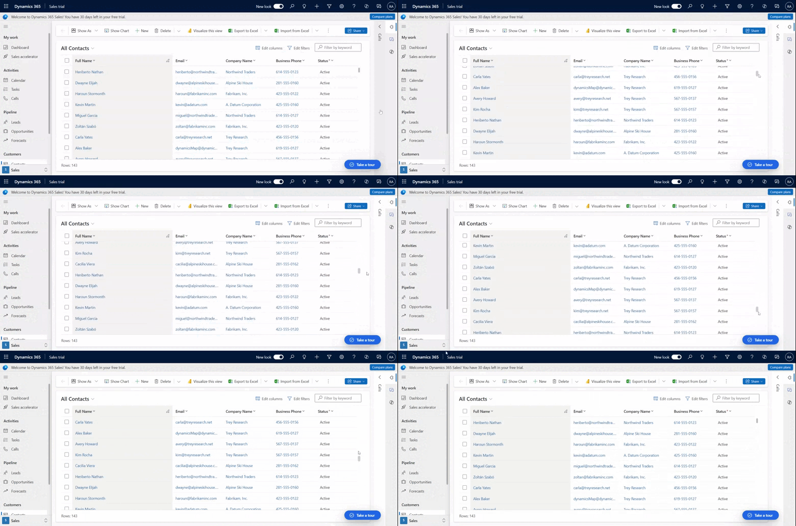
- Infinite scroll: A modern data browsing experience in which users can scroll indefinitely through data until they find the records they’re interested in. Since there are no page boundaries, users can select more rows at once (up to 1,000 rows) to facilitate taking action against a set of records or perform bulk editing.
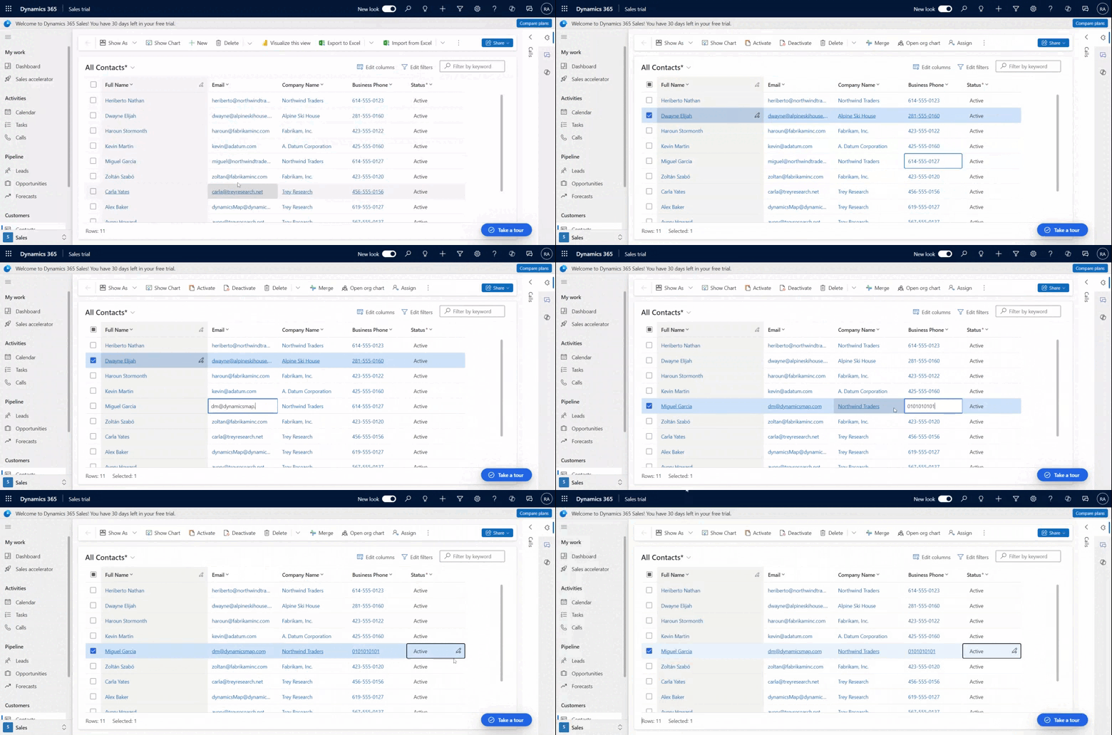
- Inline editing: This singular grid control can be utilized for read-only or edit scenarios.
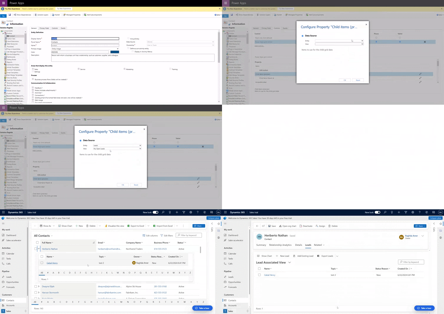
- Nested grids: Makers can configure the grid to show surface related records. When configured, users can expand a row to see a subgrid of related records. Multiple rows in the grid can be expanded simultaneously. This is an improvement over older grid experiences.
- Grouping: Users can organize tabular data in interesting ways by grouping the data based on a single column. Each group is collapsed initially, but users can expand and collapse the groups as desired. Grouping is exposed on most data types with the notable exception of lookup columns. Grouping isn’t supported when paging on the grid is enabled.
- Aggregation: Users can surface meaningful insights from their data by enabling aggregation on one or more numeric columns in a grid. For each column, users can choose to see the total, minimum value, maximum value, or average of values from that column. If grouping is applied, this aggregate value is also displayed for each group.
- Customizable: Makers have the ability to modify various experiences inside the grid component.
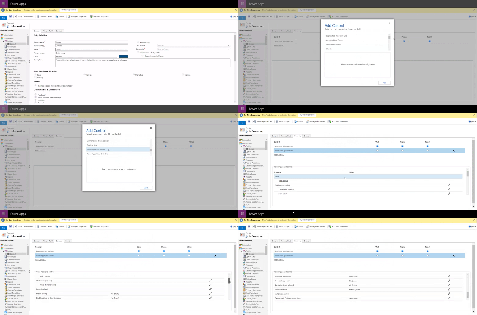
Enable Power Apps Grid
Infinite scroll
Inline editing
Nested grids
To Enable Nested Grid,:
1) Go to control”Child Items” property and click on edit.
2) select related entity from data source and its view in my case I use Lead entity save and publish
Customized cell renderers/editors
While this grid use modern Microsoft Fluent controls for viewing and editing values, we understand that certain scenarios may necessitate changes to the default visuals and user interactions. The Power Apps grid control enables makers to modify one or more columns through the “Customizer control” property.

Configure Power Apps Grid
The control includes several properties that allow you to customize the grid experience for a specific table. To modify any of these properties, select “Edit” in the corresponding row and then use the dropdown list under “Bind to static options” to change the value.
- The Enable editing property determines whether the grid is read-only or editable. The default value is No. Select Yes to make the grid editable. Editable grids have subtle visual differences to read-only grids including boolean columns showing toggle switches and dropdown and date fields displaying chevrons and date picker icons on hover or focus.
- The Enable filtering property determines if filtering options are available to users in the grid column header dropdowns. The default value is Yes.
- The Enable sorting property determines if sorting options are available to users in the grid column header dropdowns. The default value is Yes.
- The Enable grouping property determines if grouping options are available to users in the grid column header dropdowns. The default value is No.
- The Enable aggregation property determines if aggregation options (sum, minimum, maximum, average) are available to users in numeric columns of the grid. The default value is No.
- The Allow column reordering property controls whether users can reorder columns from directly within the grid. This includes drag-and-drop of the column headers or using Move left and Move right actions from the column header dropdowns. The default value is No.
- The Enable multiselect property determines whether users can select multiple rows in the grid simultaneously or just a single row. The default value is Yes.
- The Allow range selection property controls whether users can select a subset of the grid and copy that data to another application like Excel. The default value is Yes.
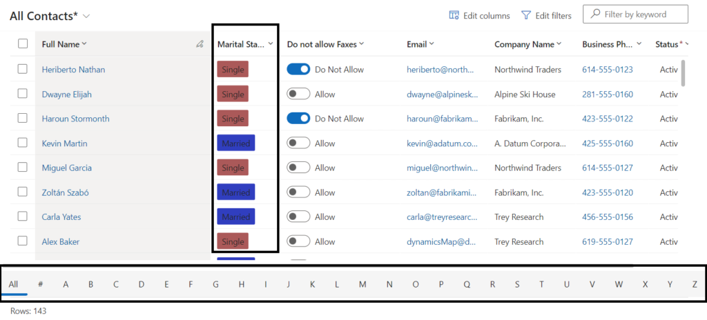
- The Enable jump bar property can be used to display an alphabetic list at the bottom of views or subgrids. The default value is No. Below is a screenshot of the jump bar enabled for the contact table in a model-driven app.
- The Enable pagination property can be used to decide between modern data browsing (infinite scroll) and paging buttons. The default value is No. Select Yes to disable infinite scrolling and surface paging buttons. Note that the Select all action isn’t available currently when using infinite scroll, but users can still perform range selection
- The Enable OptionSet colors property can be used to increase the visual appeal of choice columns by showing each value with its configured background color. The default value is No. Be sure to verify the configured color for each choice column to ensure readability and accessibility before enabling this property for a table.
- The Show row status icons property controls whether users see status icons (invalid, save in progress, saving, etc.) at the beginning of a grid row during the editing experience. The default value is Yes.
- The Show data type icons property determines whether column headers display an icon corresponding to the data type next to the column name. The default value is No.
You could definitely see your enthusiasm in the article you write.
The arena hopes for even more passionate writers like you who aren’t afraid to say how they believe.
Always fillow your heart. http://Boyarka-inform.com/